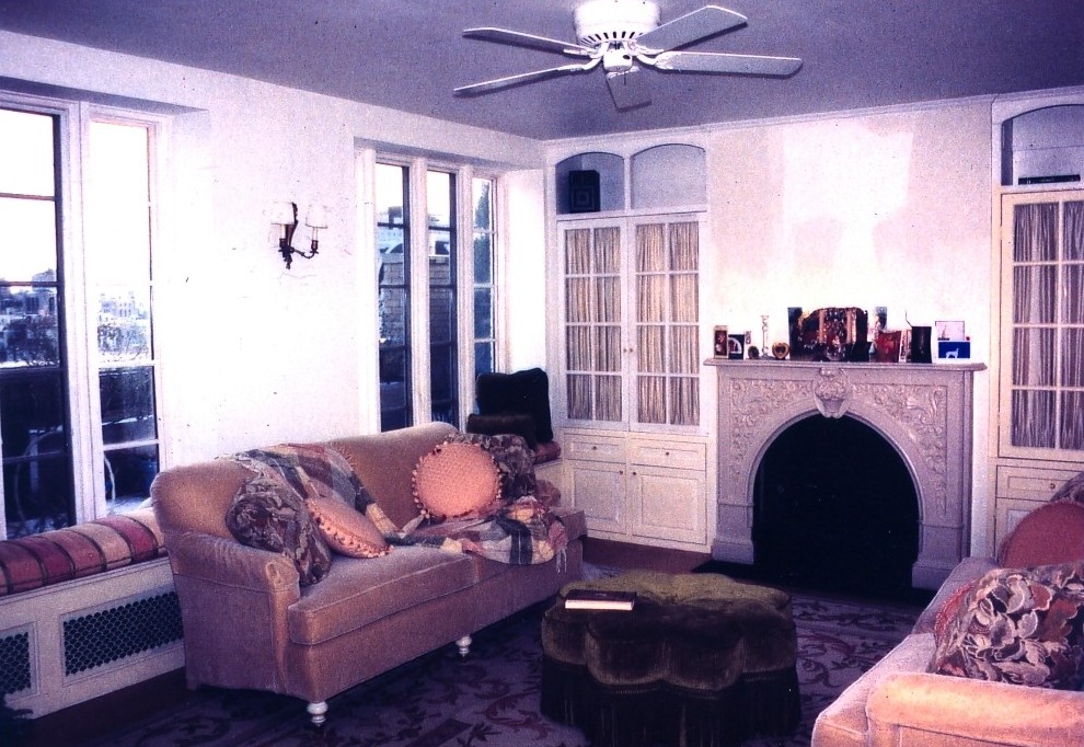
Project Description
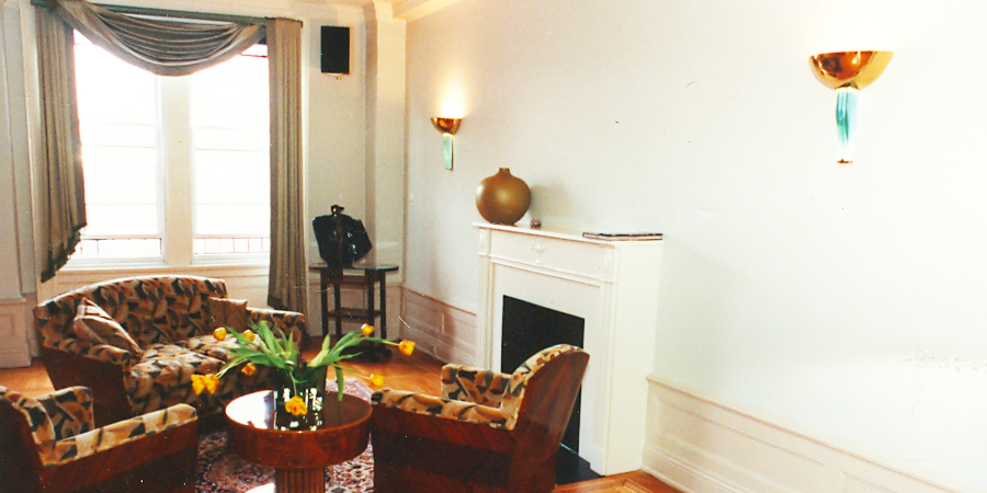
One of the pleasures of being the kind of interior designer I am is that each client I have is quite different. Since my objective is to create interiors that reflect the client’s lives and needs, then each project has been unique to them. The starting point for The Classic Six was many wonderful possessions the client had collected at auction that were beautifully made in the 1920’s and 1930’s. After they were sent out for meticulous French polishing, the furnishings became the inspiration for the rest of the project.
Schumacher reproduces the beautiful chenille upholstery fabric of that period that I used on the chairs and love seat. The color of the geometric wood detailing on the back of these pieces inspired the stain used on the inlaid bordered hardwood floors, after their restoration.
The circular side table is esthetically the most gorgeous piece of furniture I ever met. The combination of Glass tubings in the base with brass ribbing, thick green glass and several kinds of wood, all in exquisite balance, is perfection.
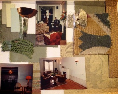
Though there have been “knock-offs” made of the classic sconces shown in this room, we purchased these originals from Maison Gerard in NYC. The textured fabric shown at the bottom of the page was used for a lampshade, that I had to handcraft myself in the French dressmaker style, for another seating area of the living room. Lighting a space using period decor can be a challenge, as rooms in the early 20th century were dingily lit and would never do with current lifestyles.
Drapery styles at that time also contributed to keeping the natural light out. I only framed the bold living room windows with the asymmetrical draping of the age done in heavy, satin back Clarence House fabric with thick tone on tone fringe. No need today to cover the lovely views of the Hudson River with heavy curtains.
Donald Kauffman was commissioned to create the timeless colors for the walls during the time I created this client’s first apartment, which also faced the river. Donald was inspired by the tones of the water, the sky and that particular light you get above the trees of Riverside Drive that he saw from the apartment window. Of course we used the color palate again in the second larger apartment.

